
Big Data refers to data that, due to its quantity and complexity, requires specific applications in order to be processed. New trends in urbanism, data collection, and management, not to mention the development of new platforms and tools, have given rise to a new era in urban analysis, creating new resources to understand, evaluate, and manage the evolution of cities.
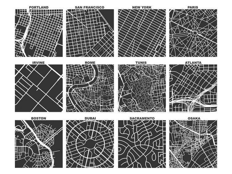
In spite of these developments, it's been a long tradition of urban planners to opt for visual methods to model cities. From Giambattista Nolli's iconographic maps of Rome to Allan Jacobs' street diagrams, visual culture has been the go-to method for urban planners to illustrate and communicate their work. Cartography especially has sought to convey the complexities of urban anatomy in a comprehensive, visual format.
_01-12_-_crop.jpg?1581995969)
So, how can we take a compilation of visual information and make it legible for both planners and residents? How can we process and classify these complex patterns using the modern power and flow of computer programs?
In his recent study "Spatial Information and the Legibility of Urban Form: Big Data in Urban Morphology" urban planner and University of Southern California professor Geoff Boeing discusses urban exploration based on big data and argues that raw data has no pragmatic application, asserting that it is necessary to translate and compress large quantities of data in order to produce valuable, legible information that can be accessed and understood by the general public.
Basing his work on the visual relevance of planning, his article analyzes the collaboration between two programs to transform data into simplified information. The first program he looks at is OpenStreetMap (OSM), a worldwide cartography community and online geospatial information system that serves as a free-access high quality database of the world's urban street networks. The second program, OSMnx, is a Python packet for analyzing data that allows researchers and other professionals to easily download information on streets, buildings, and services, automatically transforming the information into graphics. These are just two examples of massive amounts of data being rendered into images and comprehensive maps.
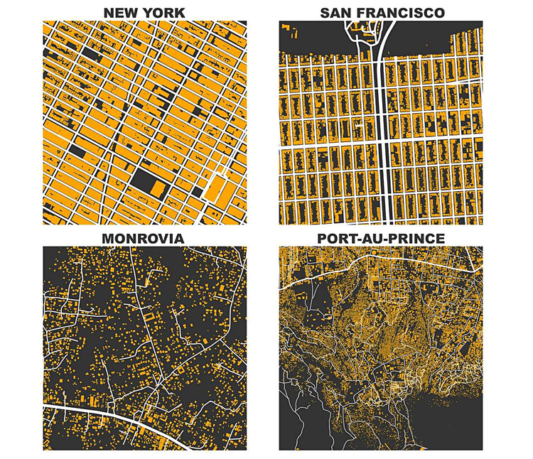
In a prime example, Geoff Boeing utilizes the OSMnx application to produce figure-ground diagrams with streets and building prints, comparing the urban structures of two U.S. cities, New York and San Francisco, with informal settlements in Monrovia, Liberia and Port-au-Prince, Haiti. The graphics offer a simple look at how buildings initially align with the streets, leaving space in the center of each city block. In the settlements, however, there is no method or planning behind the layout of the buildings or streets. Ideally, this graphic data could help planners and residents in Monrovia and Port-au-Prince to collaboratively study and implement formal street networks into the settlements without interrupting the day to day life of residents.

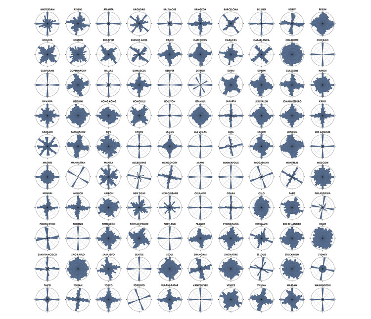
Secondly, Boeing produces a series of polar histograms or "wind roses" as a means to visualize a city's structural norms. Each polar histogram visualizes how streets are orientated on a compass. For example, the diagram of Manhattan clearly illustrates the dominant rectangular grid, compressing a large quantity of urban data into simple, legible information.
